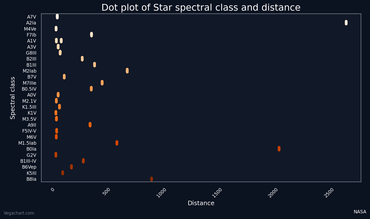
Chart Guide

Chart Types

Descriptions for chart types and their use cases.

Scatter Plot

Scatter plot example

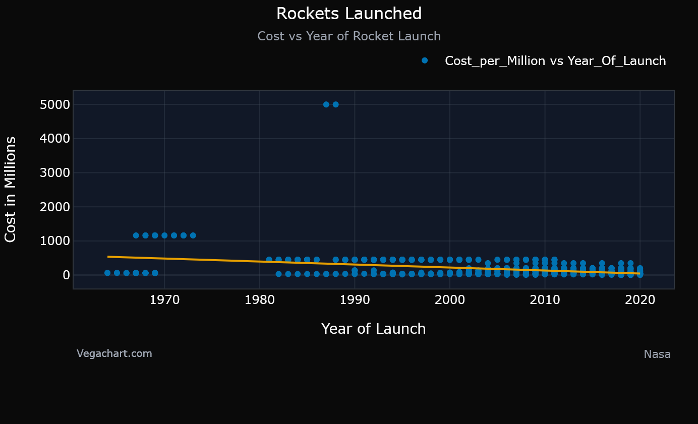
Dots plot two variables to reveal correlations, clusters, or outliers.

Data Types: Two continuous variables.

Pros: Highlights relationships and trends; flexible for large data with colors or trend lines; can include a line of best fit.

Cons: Overcrowds with dense points; no aggregation; needs expertise for interpretations.

Line Plot

Line plot example

Connected lines track changes over ordered data like time for trend visualization.

Data Types: Continuous x continuous; treats duplicates as points; ideal for sequences.

Pros: Clear for trends and progressions; easy multi-line overlays.

Cons: Assumes continuity and can mislead on sparse or discrete data; overwhelms with many lines.

Bar Plot

Bar chart example

Rectangular bars show categorical data values for easy group comparisons.

Data Types: Categorical (discrete) x quantitative (discrete/continuous); aggregates duplicates by summing or counting.

Pros: Simple to compare categories; supports stacking for details; intuitive for totals.

Cons: Clutters with many categories; misleading for continuous trends; ignores distributions.

Box Plot

Box plot example

Box and whiskers summarize distribution: median, quartiles, range, and outliers.

Data Types: Duplicative discrete value x continuous.

Pros: Compares group distributions efficiently; robust to extremes; concise overview.

Cons: Hides data shape or multimodality; unclear for small datasets; less intuitive.

Violin Plot

Violin plot example

Density-shaped "violins" show data distribution and summary stats side-by-side.

Data Types: Duplicative discrete value x continuous.

Pros: Reveals density, skewness, and modes; better than boxes for shape insights.

Cons: Complex to read; bandwidth-sensitive; needs larger data and many duplicates for accuracy.

Dot Plot

Dot plot example

Dots mark individual values along an axis to display frequencies or distributions.

Data Types: Discrete value x continuous.

Pros: Shows exact points clearly; simple for small data; avoids binning issues.

Cons: Clutters with large or many duplicates; tricky for wide ranges; manual scaling.

Pie Chart

Pie chart example

Slices represent category proportions of a whole for quick share views.

Data Types: Single discrete category (percentages to 100%).

Pros: Intuitive for parts-of-whole; fast for three to six categories.

Cons: Inaccurate size comparisons; poor for many or tiny slices; not for trends.

Jitter Plot

Jitter plot example

Randomized point positions reduce overlap in dot plots for visibility.

Data Types: Continuous or discrete (addresses ties and duplicates) by adding noise to clustered data.

Pros: Uncovers patterns in dense data; keeps points distinct; easy enhancement.

Cons: Distorts precise positions; still clutters at extremes.

Histogram

Histogram example

Binned bars show frequency distribution for continuous data shape.

Data Types: Single continuous variable.

Pros: Visualizes skewness and modes; scalable for large continuous data; configurable bin count.

Cons: Bin choice alters appearance; hides individuals; weak for small or comparative data.

Programming Languages (And Libraries)

Libraries Vega Chart generates for you.

JavaScript (Plotly)

Interactive, responsive charts for the web with simple configuration.

JavaScript is one of the core languages powering the web, with 99% of websites incorporating it to add essential functionality and advanced features. Plotly is a powerful JavaScript charting library that lets you build interactive visualizations entirely in the browser with no server dependencies required. Concerned about privacy? Charts are generated locally on your device, ensuring your data never touches Vega Chart servers. While uploaded files and charts aren't stored by our servers, this client-side approach adds an extra layer of reassurance.

Python (Seaborn)

Seaborn logo Seaborn wordmark

Built on matplotlib with beautiful defaults and statistical helpers.

Python is a versatile and intuitive programming language, widely adopted in data science, machine learning, and general-purpose programming for its simplicity and vast capabilities. Seaborn is a powerful Python visualization library built on Matplotlib, a more intricate foundational tool that enables the creation of beautiful, informative statistical graphics with remarkably little code when using Seaborn. Like Python itself, Seaborn emphasizes ease of use while delivering high-impact results.

R (Ggplot2)

Elegant grammar of graphics for layered plots and statistical summaries.

R is a programming language crafted by statisticians for statisticians, serving as the leading alternative to Python for data analysis and visualization, especially in scientific applications. ggplot2 is R's premier plotting package, leveraging a layered grammar of graphics to produce complex, publication-ready charts with elegance and precision. R blends a sharp focus on statistical programming with intuitive ease, making it accessible even for those with limited prior coding experience.